
← Back to portfolio

Featured work

Mint Condition

A Chrome extension that helps shoppers discover secondhand alternatives while they're already browsing, turning sustainability into an in-context decision instead of an extra step.

Chrome ExtensionProduct DesignFrontendUX Research
Mint Condition logo
Problem

Sustainable shopping often requires leaving the page and doing extra research, which breaks the flow at the exact moment someone decides.

Solution

Mint Condition surfaces secondhand alternatives directly in the shopping experience, making better options feel quick and obvious.

Role

Product design and frontend implementation, from concept to production.

Tools

Chrome APIs, JavaScript, Cloudflare Workers, product prototyping.

Outcome

Built and launched an in-context shopping experience for better secondhand discovery.

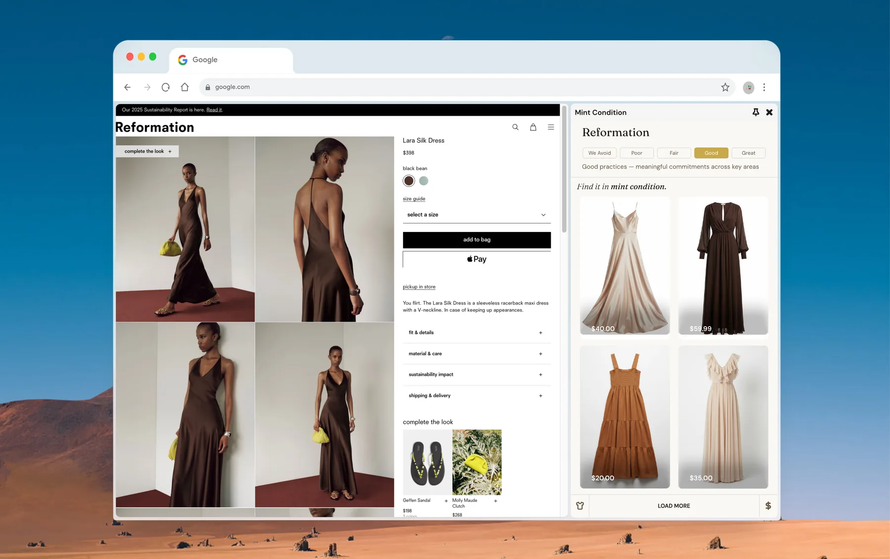
Mint Condition product context preview

Problem

Sustainable shopping breaks at the exact moment of intent.

People find the product they want, feel the momentum, and then hit a wall. The sustainable option requires leaving the page, opening a new tab, comparing prices, and doing extra research. By the time they decide to change path, the original decision is already gone.

Opportunity

The better decision needs to appear where the decision is already happening.

The real opportunity was not to lecture people about sustainability. It was to make the better choice feel obvious in the exact moment they were deciding. That meant bringing secondhand discovery into the shopping flow instead of asking people to take a separate detour.

User behavior

Shoppers do not want more friction. They want clarity and momentum.

People are not searching for sustainability in a vacuum. They are already in a familiar shopping flow. The design needed to fit that pattern without interrupting it: visible, quick to scan, and easy to act on.

Interaction model

A side panel gave alternatives context without stealing the page.

I tested a few patterns before landing on the in-context panel. The key was to show a secondhand alternative next to the main product without taking attention away from the purchase decision. It felt like a helpful recommendation, not a preachy intervention.

Design decisions

The interface stays calm, useful, and easy to understand.

The system leans toward strong hierarchy, simple language, and low cognitive load. The product does not ask for a moral decision. It simply makes the better option feel natural, useful, and immediately actionable.

Outcome

Better secondhand discovery becomes part of the shopping experience itself.

The result is a product that surfaces alternatives in context, keeps momentum intact, and reframes sustainable shopping as an obvious, low-friction decision. The user sees the option, understands the value, and can keep moving without losing the thread of intent.

Open in Chrome Web StoreBack to home